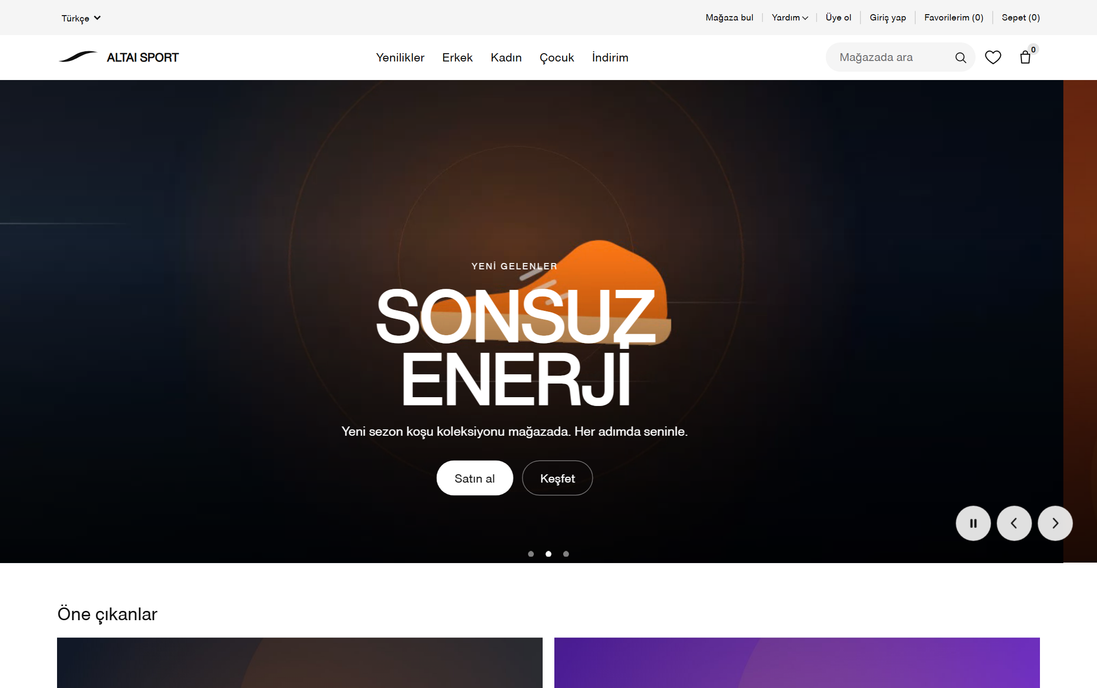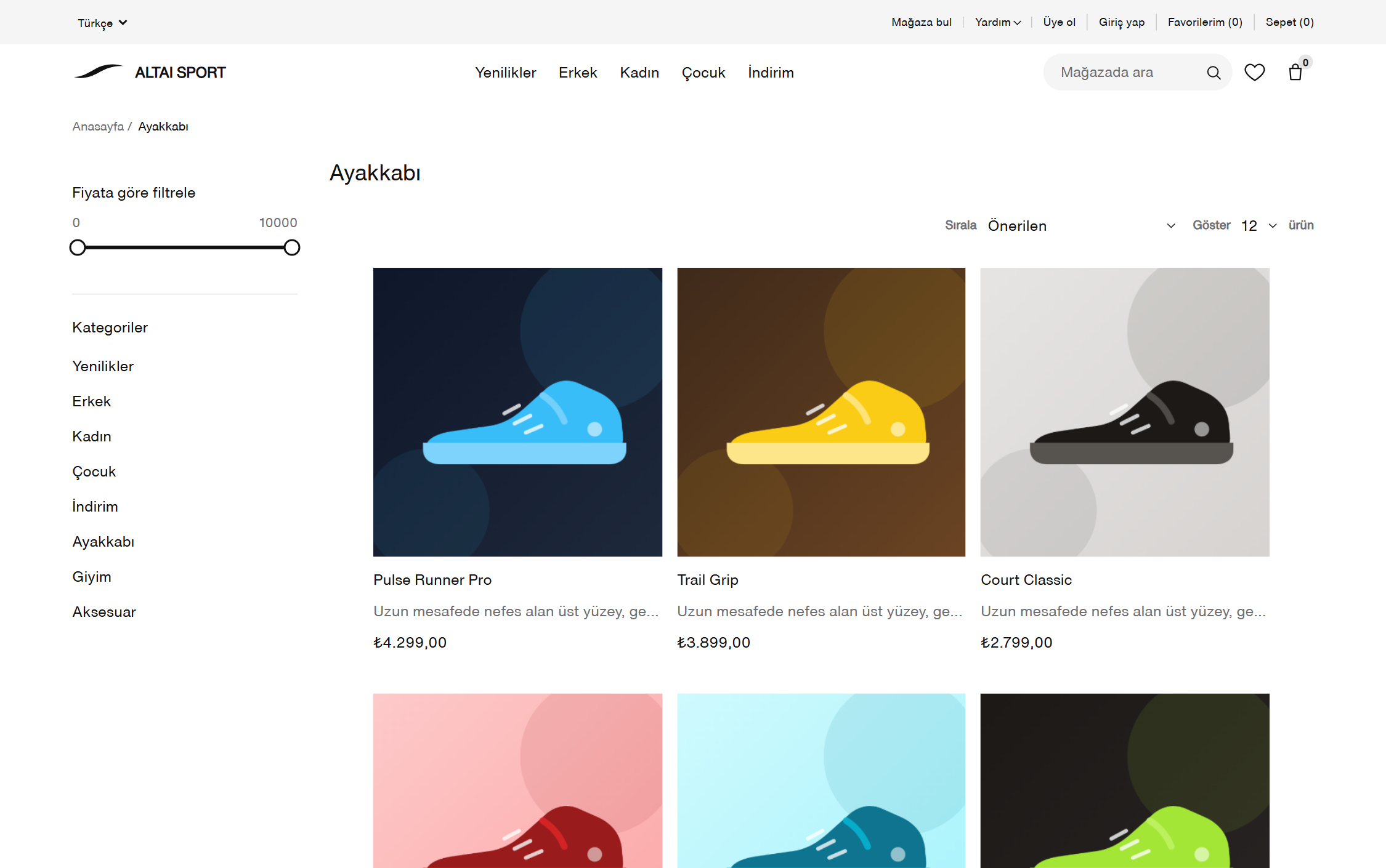
We do not use off-the-shelf templates; every interface is built from scratch and is original. But what goes at the top of the menu is decided by where people actually click, not by opinion.
Most design meetings are an argument about taste: the client points somewhere, the agency defends somewhere else, and the loudest voice wins. We hand that argument over to data.
We take what you say seriously — you know your sector, your customer and your margin. But where the button sits is decided by user behaviour.

We do not start with a blank page. We go through the interfaces of the largest players in your sector: how they greet the user, where they lose them, which pattern has become the sector standard.
We use those findings for calibration, not for copying. Your customer is already fluent in those interfaces; breaking a familiar pattern without a reason costs you. We take the familiar pattern and adapt it to current design technique.
Then we produce a prototype. The conversation happens over a clickable interface rather than a slide deck — misunderstandings end there.
Six steps. None of them gets skipped, because a skipped step comes back later at twice the cost.
Who uses it, what job they are trying to finish, where they get stuck. We listen to you and your team.
The interfaces of three to five leading players in your sector are mapped step by step. What is standard and what is weak gets written down.
A clickable prototype. Not slides — an interface you can actually walk through, discuss and change.
We do not buy templates. Colour, typography, spacing and components are built from scratch for your brand.
After launch we track clicks, flow completion and drop-off points. First reading two weeks in.
The layout is corrected to whatever the data says. Design does not end at delivery; it matures through measurement.
Being original does not mean reinventing everything.
Contrast ratios, keyboard navigation and screen reader support are rules from day one. Accessibility bolted on afterwards does not hold.
Design starts at the narrow screen and opens out. Done the other way round, mobile is always the leftover.
Every page gets a weight limit. A beautiful page that loads late is lost revenue.
We deliver a reusable component set, not one-off screens. Adding a new page should take hours, not days.
Button labels, error messages and headings are written in one voice. Interface copy is design too.
Every screen we deliver comes with the metric it is expected to improve. If it does not, we come back to it.
We are based in Singapore. We work in a market where several languages, currencies and payment habits run at the same time, and that teaches you not to build an interface around a single type of user.
Our team is experienced in commerce storefronts, admin panels and integration work. We know our craft — and we say that not as a claim, but as something you will recognise when you see the prototype.

We will open a demo account for you — try it with your own product data. No installation, half an hour is enough.